Key Strategies for Creating Compelling Packaging Design
What Colour Palettes Can Boost Product Visibility?
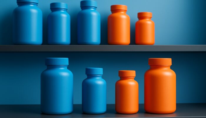
Choosing the right colours for supplement packaging is crucial for making a memorable first impression. Colours evoke specific emotions and perceptions, so selecting shades that communicate trust and energy can significantly enhance a product’s visibility in retail settings. Testing various colour combinations enables brands to identify which palettes resonate most effectively with their target audience while staying true to their brand identity, thereby increasing the product’s overall appeal.
For health-oriented products, colours like green and blue are often associated with vitality and calmness, respectively. These selections not only capture consumer interest but also align with their expectations. Conducting focus groups or surveys can provide valuable insights into how different colour schemes influence consumer perceptions and purchasing behaviour, ensuring that the final design meets market demands.
How Can You Create the Perfect Harmony Between Text and Images?
Successful packaging design requires a balanced blend of text and imagery. Essential information, such as ingredients and benefits, should be easily readable without overwhelming the overall design. Achieving this balance allows consumers to quickly understand the product’s value while being captivated by attractive visuals.
Utilising white space strategically can enhance readability and direct consumer attention. Designers should emphasise critical elements, such as the product name and health claims, while ensuring that imagery complements the text rather than overshadowing it. This approach creates an inviting design that encourages consumer interaction.
Why Is It Important to Understand Consumer Visual Behaviour?
Creating engaging supplement packaging involves recognising consumer visual habits. Key behaviours to consider include:
- Consumers frequently scan rather than read thoroughly.
- Bright colours instantly capture attention.
- Familiar shapes and layouts promote a sense of comfort.
- High-quality images enhance perceived value.
By considering these visual behaviours, designers can tailor packaging to effectively meet consumer expectations. Prioritising clarity and visual appeal enables brands to attract interest and drive sales.
How Can Colour Choices Enhance Product Visibility?

What Benefits Do Contrasting Colours Provide?
Employing contrasting colours is vital for improving visibility on supplement packaging. These colours create focal points that highlight important information, such as product names and their benefits. This immediate visual impact is essential in competitive retail spaces where numerous products vie for consumer attention.
Contrasting colours can also effectively convey the product’s purpose. For instance, a bright yellow set against a dark background can suggest energy, while softer pastel shades may imply calmness or relaxation. By thoughtfully applying contrasting colours, brands can clearly communicate their message and stand out in busy retail environments.
What Advantages Do Monochromatic Colour Schemes Offer?
Monochromatic colour schemes create a sleek and elegant look, appealing to consumers in search of premium supplements. By incorporating various shades of a single colour, brands can convey simplicity and sophistication, effectively representing quality and purity.
This design approach is particularly effective for organic or natural supplements, where a minimalist aesthetic enhances brand credibility. Monochromatic designs also streamline production processes, ensuring consistency across different packaging formats while maintaining visual allure.
How Can You Leverage Colour Psychology in Your Designs?

Understanding colour psychology is fundamental for designing effective supplement packaging. Colours can significantly affect consumer perceptions regarding efficacy and safety. For example, blue typically signifies reliability and trustworthiness, making it a popular choice for health products, while green represents health and wellness.
Selecting colours that reflect the supplement’s purpose can enhance its attractiveness. For instance, soothing shades like lavender or soft blues are suitable for sleep aids, while vibrant reds or oranges can energise consumers looking for pre-workout supplements. This careful application of colour can greatly influence consumer choices and foster brand loyalty.
Proven Methods for Designing Engaging Supplement Packaging
How to Keep Abreast of Current Design Trends
Staying updated with the latest design trends is essential for creating visually appealing supplement packaging. Trends evolve based on consumer preferences and market dynamics. For example, the increasing emphasis on sustainable packaging has prompted many brands to explore eco-friendly materials and designs that resonate with environmentally conscious shoppers.
Emerging trends such as minimalism, bold typography, and interactive packaging can greatly enhance visual engagement. By remaining informed about these trends, brands can adopt innovative strategies that attract attention and differentiate themselves in a crowded marketplace, ultimately leading to increased sales and improved brand recognition.
What Can Be Learned from Successful Case Studies?
Analysing successful examples of supplement packaging can provide valuable inspiration for new designs. Brands like Garden of Life and Vital Proteins effectively use vibrant colours and clear labelling to communicate their products’ health benefits. Their packaging not only stands out but also instils a sense of trust and quality.
By incorporating proven strategies from these successful brands, emerging companies can develop innovative packaging concepts. For example, using transparent elements to showcase product quality or adopting unique shapes can create memorable unboxing experiences. Such tactics can help newcomers establish a strong presence in the competitive supplement market.
How to Assess Material Finishes for Visual Appeal?
The choice of material finishes significantly impacts the overall attractiveness of supplement packaging. Textures and coatings enhance tactile appeal and perceived value, making products more enticing to consumers. For instance, matte finishes can convey sophistication, while glossy coatings suggest vibrancy and energy.
Understanding the target market is essential when selecting materials. Premium supplements typically benefit from high-quality finishes that elevate perceived worth, while budget-friendly products may prioritise practicality. By carefully evaluating material options, brands can create packaging that meets consumer expectations and enhances overall product allure.
How to Explore Colour Psychology More Deeply?
Exploring colour psychology can provide valuable insights for supplement packaging design. The right colour palette can elicit desired emotional responses from consumers, increasing visual impact and brand recall. For instance, warm colours like orange and yellow can inspire feelings of energy and enthusiasm, making them ideal for fitness supplements.
By choosing colours that resonate with the target audience, brands can enhance their packaging’s overall appeal. This strategy captures consumer attention and reinforces the connection between the product and its intended benefits. Understanding the psychological implications of colour can lead to more effective packaging designs.
How to Use Typography to Enhance Readability?
Typography plays a pivotal role in packaging design and can significantly affect readability and brand messaging. Selecting the appropriate fonts ensures that essential information is easily legible while reflecting brand values. For example, sans-serif fonts often appear modern and clean, making them suitable for health-focused products.
Focusing on font size, weight, and spacing improves readability. A well-structured hierarchy guides consumers through the packaging, highlighting key benefits and ingredients. By refining typography choices, brands can create packaging that stands out and effectively engages health-conscious consumers.
What Factors Should Be Considered Regarding Shape and Size?
How to Improve User Experience with Ergonomic Container Design?
The ergonomics of containers are essential in supplement packaging design. Shapes that fit comfortably in consumers’ hands enhance user experience and encourage repeat purchases. For instance, rounded edges or contoured designs facilitate gripping bottles, particularly for daily supplement routines.
Understanding how consumers interact with the product can inspire innovative designs that improve usability. Features such as easy-open lids or measuring scoops can significantly enhance user experience, increasing the likelihood of repeat sales.
How to Determine Appropriate Sizes for Various Products?
Different supplement formats require specific dimensions to ensure practicality in storage and transport while maintaining a prominent shelf presence. For instance, larger containers are ideal for bulk items like protein powder, whereas smaller bottles are suitable for vitamins and minerals that consumers may wish to carry conveniently.
Understanding the preferences of the target market can guide size selection. Offering multiple sizes caters to diverse consumer needs, making products accessible and convenient for various lifestyles. This flexibility can enhance brand loyalty and drive sales.
What Unique Structural Elements Can Be Incorporated into Packaging?
Innovative shapes and structural features can set supplement packaging apart from competitors. Unique designs create memorable unboxing experiences for consumers, enriching their overall interaction with the product. For example, creative bottle shapes or packaging that unfolds into a display can capture attention and encourage sharing on social media.
These structural innovations can also serve functional purposes, such as enhancing stability or facilitating pouring. By incorporating distinctive elements, brands can create packaging that stands out on shelves and fosters a connection with consumers, ultimately enhancing brand recognition and loyalty.
Research-Driven Benefits of Crafting Eye-Catching Supplement Packaging
How to Assess Visual Appeal Using Metrics?
Research indicates that visually appealing packaging designs can significantly increase purchase intent among health-conscious consumers. Metrics such as eye-tracking studies show that well-executed packaging captures attention more effectively than generic designs. Brands can utilise these insights to create visually compelling packaging that resonates with their target audience.
Implementing design strategies backed by data can enhance sales performance. For instance, brands prioritising aesthetics in their packaging often experience higher conversion rates, as consumers are more inclined to select products that visually stand out. This relationship between design and sales underscores the importance of investing in captivating packaging.
What Role Does Testing Play in Assessing Engagement?
A/B testing is an effective method for evaluating engagement and conversion rates related to supplement packaging. Brands can develop design variations and test them with target audiences to identify which elements resonate most effectively. This data-driven approach ensures that packaging decisions are informed by actual consumer preferences.
Real-world examples illustrate the success of optimised packaging. Brands that implement A/B tests frequently report significant improvements in sales and customer engagement, highlighting the importance of continuous testing and refinement throughout the design process. This iterative methodology can lead to more successful packaging outcomes.
How Do Design Choices Affect Brand Recall?
Strong visual designs are crucial for enhancing brand recall among consumers. Packaging featuring unique colours, typography, and shapes creates lasting impressions, making it easier for consumers to remember brands long after their initial encounter. This memorability fosters greater loyalty and encourages repeat purchases over time.
Research shows that consumers tend to favour familiar brands when making purchasing decisions. By investing in striking packaging that reinforces brand identity, companies can establish stronger connections with their audience, ultimately promoting long-term success in the competitive supplement market.
How to Seamlessly Integrate Branding Elements?
What Is the Optimal Way to Align Logos with Overall Design Themes?
Strategic logo placement is essential for reinforcing brand identity on supplement packaging. A well-positioned logo should complement the overall design without causing clutter. This alignment fosters a cohesive look that resonates with consumers and enhances brand recognition.
Choosing the right size and placement for the logo is crucial. It should be prominent enough for easy identification without overshadowing other design components. By ensuring the logo aligns with the overall aesthetics, brands can achieve a polished appearance that conveys professionalism and quality.
Which Storytelling Elements Can Enhance Brand Value?
Integrating storytelling into packaging can considerably elevate its value. Narrative elements that communicate product origins, ingredients, and benefits create emotional connections with consumers. For instance, sharing the story behind a supplement’s creation or highlighting sustainable sourcing can resonate with shoppers seeking authenticity.
These storytelling components help a brand differentiate itself in a saturated marketplace. By delivering a compelling narrative through packaging, brands can engage consumers more profoundly, fostering loyalty and encouraging them to share their experiences. This approach ultimately increases the product’s overall appeal.
How to Ensure Consistency in Visual Themes?
Consistency in visual themes is crucial for building a recognisable brand identity. Consider these key elements:
- Colour palettes that embody brand values.
- Typography that reflects brand personality.
- Imagery that showcases product advantages.
- Shapes that resonate with target audience preferences.
By maintaining consistency across packaging designs, brands can create a unified appearance that reinforces their identity and builds consumer trust. This strategic approach ensures that products are easily identifiable and memorable, ultimately driving sales and enhancing brand loyalty.
How to Refine the Final Design Through Testing?
Why Are Consumer Feedback Sessions Essential for Improvement?
Gathering consumer feedback is a vital step in refining supplement packaging designs. Conducting focus groups or surveys can yield valuable insights into proposed designs, helping identify areas for enhancement before mass production. Engaging with the target audience ensures that the final design resonates with consumer preferences.
Feedback sessions can reveal aspects of the design that may not be effective. For example, consumers might express confusion over labels or suggest alternative colour palettes. By integrating this feedback, brands can improve the packaging’s appeal and effectiveness, leading to better market performance.
What Are the Advantages of Testing and Refining Designs?
Testing and refining packaging designs offer several notable benefits:
- Increased consumer engagement.
- Stronger brand loyalty.
- Higher conversion rates.
- Better alignment with market trends.
These advantages highlight the importance of an iterative design process, enabling brands to adjust and enhance their packaging to effectively meet consumer expectations.
How to Iterate Based on Performance Insights?
Ongoing refinements based on performance insights are crucial for ensuring that supplement packaging adapts to changing market demands. Analyzing sales trends, customer feedback, and engagement metrics can provide valuable information regarding the effectiveness of a design. This data-driven approach enables brands to make informed decisions about necessary adjustments.
Refining packaging designs can lead to improved consumer satisfaction and increased sales. For instance, if data indicates that a specific colour scheme or design element resonates well with consumers, brands can emphasise those aspects in future iterations. This commitment to continuous improvement fosters brand loyalty and promotes long-term success.
What Insights Can Be Gained from Analysing Competitor Packaging Strategies?
Examining the packaging strategies of leading competitors in the supplement industry can yield valuable insights into effective design trends. By analysing colour schemes, material choices, and visual styles, brands can identify what resonates with consumers and apply those lessons to their own packaging. This competitive analysis can help brands carve out a unique niche in the market.
Understanding how competitors present their products can also reveal market gaps. For instance, if most brands utilise bold colours, adopting a more subdued, minimalist approach might provide a competitive advantage. By leveraging insights from competitor packaging, brands can develop innovative designs that capture attention and stimulate sales.
Frequently Asked Questions (FAQs)
What Are the Essential Components of Attention-Grabbing Supplement Packaging?
Essential components include vibrant colours, clear typography, engaging imagery, and distinctive shapes. These elements work together to attract consumer attention and effectively communicate product benefits.
How Significant Is Colour Selection in Packaging Design?
Colour selection is critical as it directly impacts consumer perceptions and emotions. The appropriate colours can evoke trust, energy, and health, making them vital for effective supplement packaging.
What Role Does Typography Play in Packaging?
Typography enhances readability and conveys brand identity. Selecting suitable fonts ensures that vital information is clear while aligning with the brand’s overall aesthetic.
How Can Brands Effectively Test Their Packaging Designs?
Brands can evaluate packaging designs through focus groups, surveys, and A/B testing. Collecting consumer feedback helps identify strengths and weaknesses, guiding improvements before full production.
What Shapes Are Most Effective for Supplement Containers?
Effective shapes include ergonomic designs for easy handling, distinctive structures for differentiation, and sizes tailored to specific product formats. These factors enhance usability and marketability.
How Does Packaging Affect Purchasing Decisions?
Attractive packaging captures attention and conveys value, significantly influencing purchasing decisions. Research indicates that well-designed packaging can increase consumer interest and drive sales.
What Are the Benefits of Using Sustainable Materials in Packaging?
Sustainable materials appeal to environmentally conscious consumers, enhancing brand reputation and attractiveness. They contribute positively to brand image and can help products stand out in a competitive market.
How Can Storytelling Enhance Packaging Effectiveness?
Storytelling fosters emotional connections with consumers by sharing product origins and benefits. This approach encourages loyalty and motivates consumers to share their experiences with others.
What Metrics Should Brands Monitor for Packaging Performance?
Brands should track metrics such as sales trends, consumer feedback, engagement rates, and A/B testing results. These insights inform ongoing improvements and ensure packaging meets market demands.
How Can Brands Maintain Consistency in Their Packaging Designs?
Brands can ensure consistency by employing cohesive colour schemes, typography, and visual motifs across all packaging. This strategy reinforces brand identity and enhances consumer recognition.
Visit our X profile for further insights!
The article How to Design Eye-Catching Supplement Packaging was first published on https://marketing-tutor.com
The article Design Eye-Catching Supplement Packaging Effectively was found on https://limitsofstrategy.com
The Article Eye-Catching Supplement Packaging: Effective Design Tips found first on https://electroquench.com